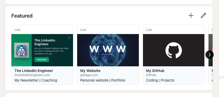
If there’s a section I believe is heavily underrated on LinkedIn, that is the “Featured”. 🤯
Its aim is basically to have in the foreground things that you believe are important to highlight.
Actually, it’s way more than that:
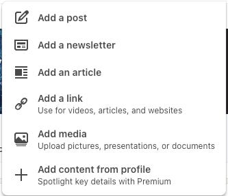
you can choose to add posts, newsletters, articles, links, medias, and content from profile (the last one is a Premium feature).
However, my recommendation is to opt for links.
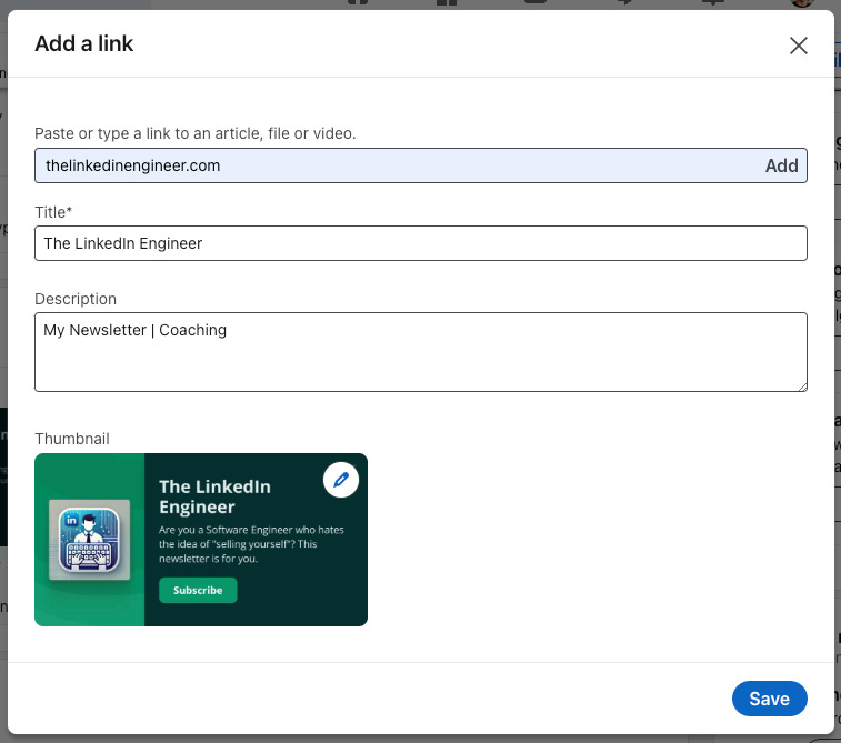
Each time you add one, you paste a link, and then you can customize the title, the description, and very importantly, the thumbnail.
This will generate a nice card that will be placed at the top of your profile, right after the About section.
Do you see the power of that?
You have the opportunity to:
Highlight important links 🔗
Catch attention with images 🌅
Make your profile aesthetically more appealing 💅
Make your profile look richer 📖
Let’s see how
🔗 Links
Which links should you put there?
Let me give you some ideas:
your Website
your GitHub
your LeetCode
your YouTube Channel
your Personal Project(s)
your Blog
also, make sure that the link doesn’t include https or www (the shorter the better).
🌅 Images
After pasting the link, LinkedIn will automatically generate a thumbnail based on the metadata of the link. In 99% of the cases, you will need to change it.
When choosing images, put yourself in the user’s shoes, and imagine what could tempt you to click.
Find high-quality, clean images with a few clear elements that perfectly represent the content you are sharing.
💅 Profile Aesthetics
Picking images is not enough: you also need to find the right balance, and images must follow a common style. That’s why, in 99% of the cases, you need to change the thumbnail: very rarely will your links already have previews that can co-exist.
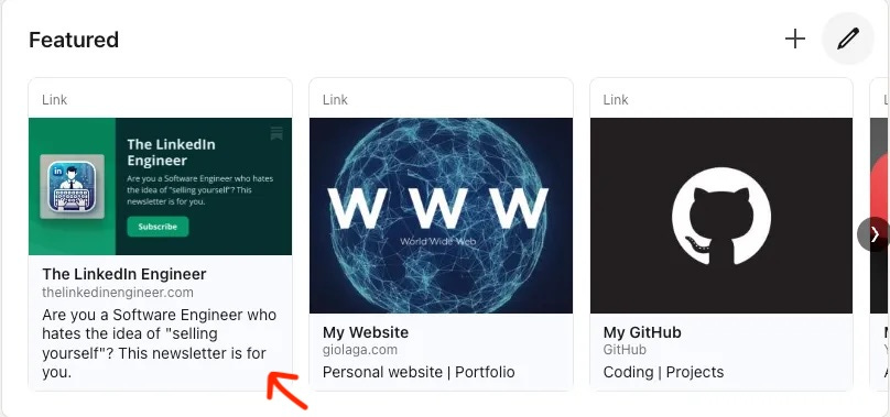
💡 Now, I give you a secret tip to find the right harmony between them: keep all your descriptions short and of the same length.
I show you why:
See what happens? The Image height gets reduced to save space for your description, and you lose the alignment between links! 😥
This seems like a ridiculous problem, but trust me, people who visit your profile will unconsciously develop a negative perception: order, symmetry, and harmony are all elements that human brains instinctively search for.
Seeing them satisfied brings a hidden sense of satisfaction.
📖 Profile Richness
It’s very important that you manage to add more than 3 links.
Thanks to that, you will create the “shelf” effect: a right arrow will appear, inviting the user to explore more. This is particularly powerful on mobile, where the user can swipe right.
It might seem like a minor detail, but I swear this contributes to building the perception that your profile is “full of content.”
Being able to create this idea increases your credibility, and visitors will likely consider your content more professional and, consequently, more important.


